Key Takeaways
Identify Your Target Audience. Understanding your customers is crucial for choosing the right design elements like typography and color schemes.
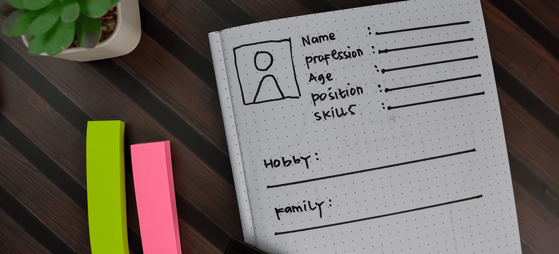
Create Buyer Personas for User Engagement. Developing buyer personas helps in designing appropriate site architecture and content strategy.
Check Out the Competition for Strategic Insights. Evaluating competitors’ websites provides a clearer picture of your organization’s standing and opportunities for gaining a competitive advantage.
Put Aside Personal Preferences for User-Centered Design. Designers and business owners should prioritize users’ preferences over personal design choices to enhance user experience.
For many people, planning a new online home is an exciting endeavor. It’s an opportunity to create something so impressive it will blow the competition away.
But this is where things can start to go wrong.
It’s all too easy to get carried away with the latest new web design trends and forget one of the most important things.
Your target audience.
Your shiny, new, cutting-edge website is of precious little use if it doesn’t appeal to the people who’re going to use it. And it will fail to deliver any tangible benefits to your business.
Your shiny, new site is of little use if it doesn’t appeal to the people who’re going to use it.
This is why, when designing websites, you have to start with the end in mind. Figure out who you’re talking to, what they care about, what they want from your website, and what functionality the site needs to offer them.

Here are ten tips for designing a website with your target audience in mind.
1. Identify Your Target Audience
Great design begins with an understanding of who it’s for. Understanding your customers is a crucial factor for being able to choose the right design elements, such as typography, color schemes, layout, and navigation.
Great design begins with an understanding of who it’s for.
In addition to knowing your audience’s demographics—age, gender, location, etc.—you need to discover what makes them tick. Who are they? What drives them? What are their beliefs and values? Which other companies are they buying from? What products do they use?
The more you know about them, the better you can design a website that meets their needs and requirements.
2. Create Buyer Personas
Now it’s time to step into your users’ shoes. Create buyer personas for each type of user who’ll be using your site and dream up some real-life scenarios. Think about what they’ll be looking for when they land on your site, and how easy it is to find that information.

Consider how they’ll find you and what you want them to do when they arrive. Are you looking to generate leads? Promote your products and services? Achieve brand recognition?
Having a clear picture of your marketing goals and your users’ requirements will enable you to design appropriate site architecture and plan a relevant content strategy.
3. Check Out the Competition
It’s common for businesses to be looking over their shoulders or peeking into the yard next door to see what’s happening. By evaluating your competition, you can gain a much clearer picture of where your organization stands.
Look carefully at your competitors’ websites to see what they have in common. You’re not looking to copy them, but rather to see what works and what doesn’t. Look at usability, design, content, layout and navigation, and optimization. Look for things they do well, but also seek out any weaknesses and opportunities to gain a strategic advantage.
4. Put Aside Personal Preferences
When designing a website, it’s absolutely essential that you, the designer, and your client, the business owner, put aside your personal preferences in favor of what works best for the users.
You may wish to try out the latest cutting-edge trend or your client may have seen a flashy element they want to include. Remember, what appeals to you may be a total turn-off for the people who’ll be using the site. As a designer, it’s your responsibility to ensure your client stays focused on the end user and that you produce a site that enhances the users’ experience and is a perfect fit for the target audience.

5. Use Typography to Speak Their Language
Custom typography is a fantastic way to express brand personality on a website, and there are numerous fonts to choose between. But choose wisely.
For a traditional, corporate feel, serif fonts (those with little feet) do a lovely job, whereas a contemporary, modern feel can be achieved by selecting a sans-serif font, which is more streamlined. Kids will enjoy fun, cartoon-style fonts. Like many things, there are exceptions to this rule, so pay close attention to what your eyes are telling you.
Font size also requires consideration. If your audience is likely to include senior citizens or people with sight problems, you need to use a minimum of 12-point fonts and have options to increase the size where necessary.
6. Choose appropriate colors
Color can influence people’s moods and emotions, and sway their behavior. So think carefully about the tone you wish to achieve.
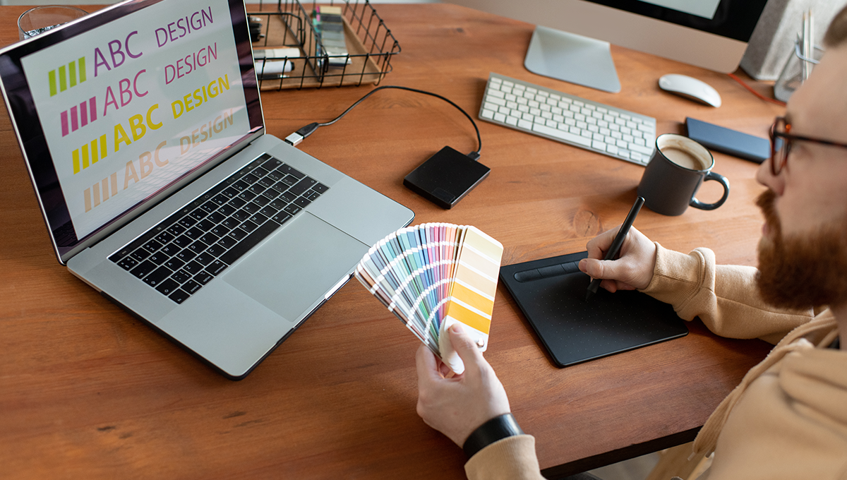
You should have a good idea of the type of colors that will appeal to your users from your initial research. Start by identifying two main colors to work from. This will make it easy for your customers to recognize and remember your brand, and it’ll make life simpler when you need to make a color choice. It’s also good practice to look for color combinations that are already working well in your industry.

7. Include Enticing Images
The old adage—that a picture is worth a thousand words—remains true. Images are processed quicker than words, so they give users an easy route into your content. Choose images that are relevant and that will pique people’s imagination and curiosity, and draw them into your world.
Images are a great tool for breaking up text and adding interest to a page, though take care not to include images for the sake of looking pretty—if they have little relevance to your content, your users will be left feeling confused.
Again, think carefully about your audience when selecting imagery for your website. A younger audience will love graphics, animations, and other media, whereas those who are less computer-literate or may not have a fast broadband connection will simply be annoyed.
8. Think About Your Content
Content is king. So your design efforts will be in vain if the site content is inappropriate or lacking in quality.
Your audience has an effect on the type of content and the style of writing. If the website is for a specific profession, then industry-specific jargon is acceptable, and often necessary. But if it’s for general use, too much jargon will result in people bouncing away in bewilderment. Especially if there are likely to be people using the site who don’t have English as a first language.
A friendly, conversational tone is perfect for a health and lifestyle website, whereas something more conservative and formal is better for a traditional industry such as banking or insurance.
9. Order Your Information Hierarchically
Ordering your information according to visual hierarchy will help your users navigate the site and absorb the information according to your clients’ preferences. Take a human-centered approach to design by basing your layout on how your users will expect the site to work.

A visual hierarchy gives all elements on a page an order of importance according to how they’re positioned and displayed. The most important thing should be the first thing users lay their eyes on, and it should be the loudest, brightest, and boldest thing on a page.
The second most important thing should be a little smaller and carry less visual weight. And so on.
10. Surprise and Delight Them
Finally, think how good it feels when a friend turns up at your house with your favorite food. You’re delighted, right?
Can you add the same feeling of surprise and delight to your website?
Introduce a fun, quirky, or helpful factor that will surprise and delight your users. This will make them more likely to remember your website and become repeat visitors, and it will help your brand personality shine through. People are more likely to work with companies that make them feel happy and comfortable, so if you can put a smile on their face, you’re more likely to turn them from visitor to customer.
If you can put a smile on their face, you’re more likely to turn them from visitor to customer.
Elevate Your Digital Experiences with WP Engine
WP Engine is the performant foundation trusted by the WordPress community to provide the best possible experiences for both site developers and visitors. Learn more about our WordPress hosting or talk to a representative to learn more!


