10 Web Design Trends for 2025
Each new year brings tools and advancements that empower designers to create innovative web designs—blending aesthetics with functionality to deliver user-friendly digital experiences.
These innovations inspire creators to think beyond convention while staying rooted in usability, accessibility, and functionality—which remain core tenets of quality design. At the same time, pushing boundaries with bold layouts and interactive elements continues to be vital for attracting and engaging users.
As we enter 2025, this article explores the trends that are poised to shape the world of web design, offering examples to inspire builders as they push creative boundaries.
From layered parallax scroll to immersive 3D visuals, web design in 2025 will fuse creativity with cutting-edge technology, delivering experiences that are visually stunning and seamlessly intuitive.
Note: Many examples featured here were also highlighted by The Webby Awards this year. Visit their site for a full list of 2024’s most impressive websites and mobile sites.

Embracing dark mode
As the web becomes more personalized, users increasingly expect seamless experiences tailored to their preferences, and companies are taking note.
Studies show that anywhere from 22 percent to upwards of 70 percent of users prefer dark mode for their digital experiences. In addition to meeting user preferences, dark mode boasts other benefits, including improved battery life for devices and reduced eye strain for users.
As of late, many companies have rightly started taking the user preference for dark mode more seriously. This year alone, the New York Times games app released dark mode options, the web version of Google Calendar released a dark mode, and Peloton introduced dark mode for its Amazon Kindle integration, allowing users to adjust font sizes and background colors to read more comfortably during their workouts.
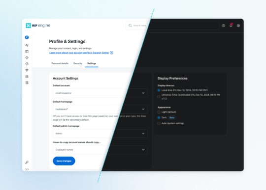
WP Engine also introduced dark mode in our User Portal, which is now available for all users! This growing adoption of dark mode across platforms highlights a broader trend of companies prioritizing user-centric design to create more comfortable, customizable digital experiences.

Storytelling through typography
One recurring trend we seewatch year after year is how designers incorporate typography into their designs.
In previous years, we’ve seen oversized typography take up extra room on our trends list, but recently, there has been an uptick in sites that use typography not only to share written content but also as a visual medium to help solidify the site’s messaging.
For example, the Kunstmuseum Solothurn is an art museum in Switzerland. Its website uses typography almost exclusively as the storytelling medium on its homepage. The page title uses simple animations to transition certain letters into digital renderings of the iconic art visitors can view on their next trip to the museum, including works from Cuno Amiet, Aloïse Corbaz, and more.
The Erased Font is another site that turns a typeface into its own storytelling medium. The custom website and font come from a project created by Free Press Unlimited. When enabled, the font “erases” 320 specific words—one for every known imprisoned journalist across the world—to highlight the importance of press freedom. Some of the words erased by the font include “freedom,” “journalist,” “war,” “democracy,” and “crime.”
The group encourages news organizations and independent media outlets to install and use the font on World Press Freedom Day to help readers visualize the effects of censorship.

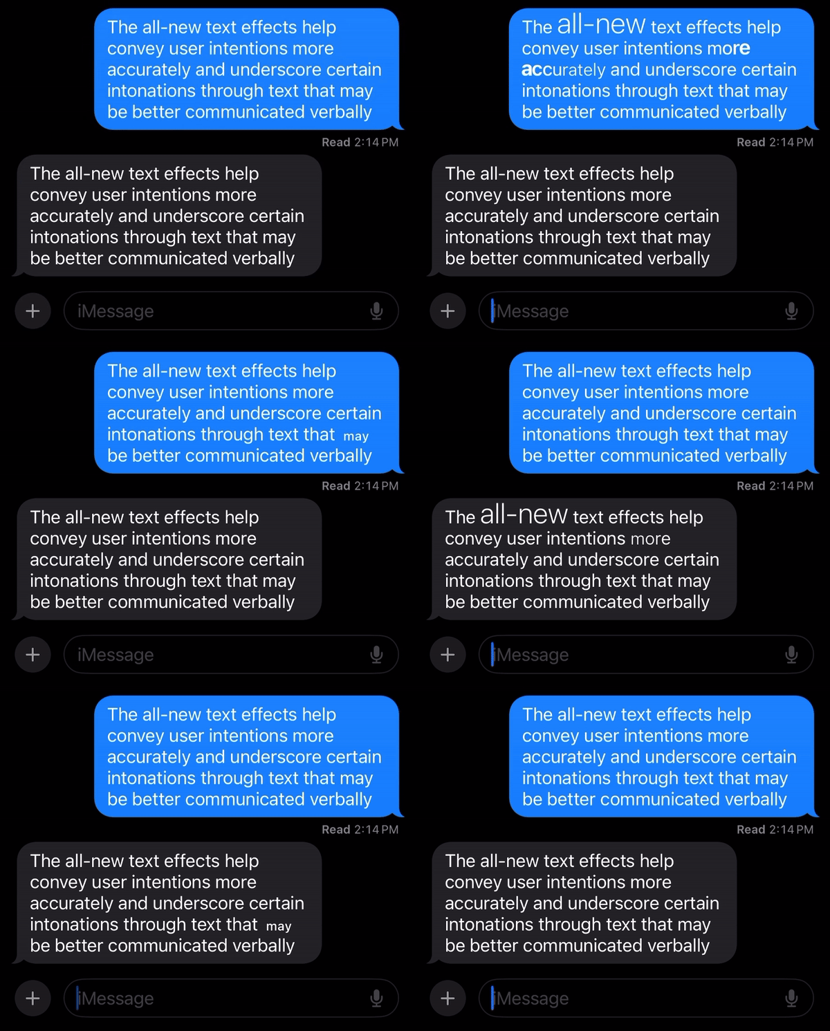
Apple also introduced dynamic text effects into an iOS update this year. The effects, introduced with iOS 18, give users more freedom to liven up conversations by allowing them to animate words, phrases, and even emojis. Thanks to this update, the words you write can be styled to be more expressive and reflective of your tone and intentions.
This renewed focus on typography as both a functional and visual tool demonstrates how designers are pushing the boundaries of text, transforming it into a dynamic medium for storytelling, expression, and engagement.

Sound design
Web design is venturing beyond the visual, with sound taking center stage as a tool for creating more engaging and memorable user experiences. Since humans perceive sound 20 to 100 times faster than visual stimuli, incorporating audio can be a powerful way to capture attention and enhance interactions.
While full background playlists might not suit every website, strategic sound design can subtly elevate user experiences. For example:
- A pleasant chime when adding an item to a shopping cart provides immediate feedback to users, reinforcing a sense of accomplishment.
- A satisfying click when adjusting product quantities adds a tactile layer to digital interactions.
- Clear but non-jarring error sounds for invalid inputs can help users identify issues and better engage with site elements.
Period Planet, a website created by U by Kotex, is a great example of sound design in action. It uses sound to transport users to the “period planet,” creating an engaging, gameified experience for all people to learn about puberty and menstruation. In fact, it employs several of the trends on this list, from 3D design elements to a very interesting scrolling experience.
Agency experts at Balarinji also use sound to enhance their message. The Aboriginal-owned agency’s website opens with a welcoming message in Yanyuwa, the language of the Yanyuwa people who were the original Aboriginal inhabitants of the Northern Territory where the agency is located. The short audio message underscores Balarinji’s mission of amplifying Indigenous culture through design excellence.
These thoughtful audio cues enrich the user journey, projecting a sense of professionalism and attention to detail. As web design continues to focus on multi-sensory experiences, sound will play a key role in driving user engagement and increasing brand recognition.

Uncommon cursors and multilayered parallax
Designers have long been reimagining the scrolling and clicking experiences of their end users. By employing unique cursor and parallax effects, designers can build multidirectional, multilayered visual experiences.
Cursors, for example, can have special functionality or simply add some visual interest to a user’s experience.
The cursor on the Lusion site is followed by a wispy, holographic tail that interacts with other elements on the site as you scroll, adding color or movement to the experience depending on which element a user interacts with.
The uncommon cursor, paired with a parallax scroll that moves in many directions (including a section where an astronaut figure falls through interdimensional space), makes for a highly visually engaging experience overall.
Similarly, innovative use of parallax effects can create a more engaging scrolling experience. For example, the Sculpting Harmony site by Getty explores the story behind the Walt Disney Concert Hall and Frank Gehry, its architect.
The site (which also showcases stellar sound design showcasing the L.A. Philharmonic that calls the hall home) has a scrolling experience that takes users on a tour of the hall, shares Gehry’s vision for the space, and dives into the process of designing a concert hall in heart of downtown Los Angeles.
By combining uncommon cursors and multilayered parallax effects, designers are transforming traditional interactions into immersive, visually captivating journeys that keep users engaged and curious.

AI-driven personalizations
Artificial intelligence continues to revolutionize the digital landscape, and in 2025, its role in web design is set to grow even more prominent. At the forefront of this trend is the rise of hyper-personalized user experiences.
The benefits for eCommerce sites are clear. Platforms can use AI to analyze stored user data, offering deals tailored to the time of day or the user’s location, or refine product recommendations based on browsing and purchase history.
For example, instead of bombarding a user who recently bought a new mattress with irrelevant mattress ads post-purchase, AI algorithms may suggest complementary items, like sheets, pillows, or comforters.
News and media sites can also leverage AI to enhance user engagement by recommending articles aligned with a reader’s past interests and interaction patterns. This creates a more compelling experience, keeping users engaged for longer periods.
AI models are increasingly effective at turning user data into actionable insights. Whether it’s guiding consumers to products they’ll love or content that matches their preferences, these tools are shaping a more tailored, efficient online future.
Incorporating AI into web design helps create more individualized experiences that resonate deeply with users while driving results for businesses. As we move into 2025, expect to see even more innovative applications of AI in the digital world.

3D elements and immersive product experiences
Modern web designers are embracing immersive experiences that bring products to life like never before. While showcasing high-quality product images from multiple angles has been a long-standing best practice, the next evolution in digital commerce is here: 3D product renderings, virtual try-on options, and fully immersive digital product experiences.
From fashion to furniture and beyond, these technologies allow users to engage with products in unprecedented ways. Using their phone cameras, shoppers can virtually try on clothes, visualize new furniture in their homes, test paint colors on their walls, or even explore custom car designs.
BMW’s customization tool, for example, is a fast, beautiful site that acts as a visual aid, allowing shoppers to see every single color BMW offers on each new model. Similarly, Sephora’s virtual makeup try-on makes it easy for shoppers to see how a specific shade will look on their skin tone just by granting the app access to their camera!
This level of interactivity helps bridge the gap between online and in-person shopping. By enabling customers to see how products fit their space or personal style, businesses can enhance buyer confidence and reduce uncertainty—key factors in preventing cart abandonment and boosting conversions.
As web design continues to focus on personalization and engagement, these highly detailed and personalized shopping experiences are becoming essential, as they help users imagine a more tactile, real-world experience of a product.

Glitch and distortion animations
Glitchy sites are generally not fun for users. However, when those glitch effects are intentional, they can add some spice to a website’s design.
Web designers are increasingly incorporating glitch and distortion elements to create visually striking web experiences that take inspiration from digital errors and retro aesthetics to evoke curiosity and encourage users to explore.
From distorted typography to broken images to flickering animations, these elements disrupt traditional design patterns to capture users’ attention. A skillful balance of these effects and fast-loading site elements creates an experience that feels fresh and dynamic.
Max Colt, for example, is an award-winning visual effects producer who employs simple distortion effects across his portfolio site to add some visual interest. Specifically, his headshot will blur as you move the cursor upon opening the site, and a wavy distortion animation is used as a transition effect as users click through his highlighted portfolio pieces.
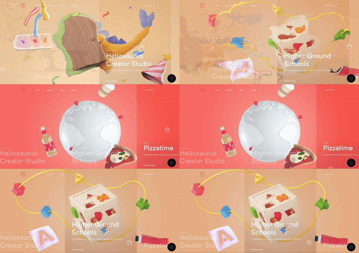
Similarly, the homepage of digital studio Planetary features a quick glitch transition effect as users scroll through case studies of its digital work.
When used intentionally and sparingly, glitch effects can break design conventions in a playful way, offering users a memorable and dynamic digital experience.

Extreme minimalism or maximalism
With thousands of competitors vying for customer attention, building a brand presence that resonates is more complex than ever. To make a bold statement, companies are making their branding efforts more extreme to align their visual messaging with their brand voice and tone.
For some, this may mean choosing “blanding” over branding, simplifying visuals to better fit the mold of what a user expects from a company. For others, extreme branding may help them break the mold entirely.
The MCA museum is a great example of an entity choosing extreme minimalism. The design lets the art speak for itself as elements load on a white background. Copy uses a simple, sans serif font, site elements use single-colored backgrounds with no apparent gradients or patterns, and any scroll or hover effects are minimal, used only to help draw attention to a specific tile.
On the other hand, maximalism is meant to draw attention by overwhelming the senses. Whatever the site’s focus is, maximalism demands a lot of it, paired with plenty of bold colors, imagery, and design elements.
The Raw Talent Network, for example, uses maximalism in its design by employing a ton of very large copy. Hover effects also introduce additional design elements that lay over the text, creating an even more overwhelming aesthetic.
Whether through the quiet sophistication of minimalism or the bold vibrancy of maximalism, these extremes in design empower brands to craft memorable digital experiences that align with their unique identity and vision.

Scrapbooking aesthetic
A handmade, cut-and-paste style continues to trend among website designs as site owners seek new ways to humanize their digital offerings.
Big, blocky sections, lots of color, and clear, short headlines with simple graphical elements are hallmarks of this design.
Both the Microsoft WorkLab and Google Labs sites are great examples of the scrapbooking aesthetic at work. Although both sites contain technologically heavy content, the imagery brings a sense of playfulness and whimsy. Using bright colors, simple shapes, and bold graphical elements, the companies seamlessly weave together high-level content with an approachable, informal design.
The International Center for Law & Economics is another example of displaying complex information in an approachable way using a scrapbook style. The header image uses a cut-and-paste style, the imagery on color-blocked elements has almost a stamp-like effect, and the simple color palette is not only bold but also serves a purpose.
Each color represents a specific research program, and every piece of content is color-coded, tying it to one of the programs. For example, anything in green is associated with the financial regulation and corporate governance program, whereas blue is tied to the data security and privacy program. This makes it easy for viewers to navigate the site and find content related to their needs more quickly.
By blending creativity with functionality, the scrapbooking aesthetic can transform complex content into approachable, visually engaging experiences that feel both playful and purposeful.

Sustainable web design
As a society, we’ve grown increasingly reliant on the Internet for everything from shopping to finding information to providing entertainment. Unfortunately, that increased reliance has come with a cost—the World Wide Web produces nearly 4% of all global carbon emissions.
And because the general population largely favors reducing carbon emissions, companies that practice sustainability are often rewarded with better reputations and more loyal consumers. Sustainable web design, then, requires designing projects that consume less resources by minimizing energy use and optimizing for efficiency.
Fortunately, sustainable web design best practices fall neatly in line with general best practices for web design and development, such as prioritizing accessibility, creating efficient user journeys, and eliminating non-essential information.
If you’re looking for more information about designing websites that consume less, load faster, and provide better user experiences, the World Wide Web Consortium (W3C) and its Sustainable Web Design Community Group have created an extensive list of guidelines for web sustainability.
Design the digital future with WP Engine!
As we move into 2025, the web design landscape is brimming with creativity and designers will continue to push the boundaries of what’s possible while staying true to the principles of accessibility and functionality. Trends like immersive 3D visuals, AI-powered personalization, and multisensory engagement all demonstrate how designers are innovating to better capture and retain user attention.
Staying ahead of the curve means adopting tools and strategies that prioritize both user experience and bold creativity—andworking with partners that do the same.
Ready to bring your designs to life with world-class website performancer? Check out WP Engine to learn more about powering your website in the new year and setting a strong foundation for digital success!
