Get Started


Key Takeaways
Mobile-friendly WordPress themes are crucial for SEO. Responsive themes reduce bounce rates, improve usability, and boost engagement, enhancing search performance.
Premium themes offer advanced customization. Features like optimized mobile menus and layout options create stellar mobile experiences.
Free themes can be a budget-friendly option. While less feature-packed, they are suitable for simple sites without advanced needs.
Consider investing in premium themes for complex functionalities. eCommerce or custom sites benefit from additional features and flexibility.
In today’s digital landscape, mobile-friendly WordPress themes are essential for ensuring your website looks and performs well on devices like smartphones and tablets.
With mobile traffic dominating the web, search engines—especially Google—prioritize mobile optimization in their ranking algorithms. Without a mobile-friendly design, your site risks lower rankings, reduced traffic, and a poor user experience that drives visitors away.
This article explores how responsive, mobile-friendly WordPress themes solve the mobile-friendliness challenge, their impact on search engine optimization (SEO), and what to consider when budgeting for these themes. We’ll also highlight some of our favorite mobile-friendly WordPress themes to get you started.
What is a responsive WordPress theme?
The concept of responsive design has evolved significantly since its introduction in the early 2000s. Coined by Ethan Marcotte, “responsive web design” refers to creating layouts based on flexible grids, adaptive images, and media queries to ensure seamless viewing across devices. This approach became an industry standard by the mid-2010s, forever changing web design.
Responsive WordPress themes incorporate these principles directly into prebuilt designs, allowing your site to automatically adjust to various screen sizes, resulting in a consistent and user-friendly browsing experience for all visitors.
Mobile-friendly WordPress themes for SEO
Google continues to emphasize mobile-first indexing, meaning your site’s mobile version plays a primary role in its search rankings. Responsive themes help reduce bounce rates, improve site usability, and boost engagement—key factors for better SEO.
For instance, a site with a mobile-friendly design minimizes “pogo-sticking,” where users open a search result and quickly leave due to a poor experience or lack of information. Fast load times and an intuitive layout can keep visitors engaged, enhancing both user satisfaction and search performance.
How much do mobile-friendly themes cost?
Mobile-friendly themes come in a wide range of options, from free to premium. WordPress’ default themes have been responsive since 2012 and remain a great no-cost starting point for small sites that don’t need many bells and whistles.
However, for more complex needs, premium responsive themes typically cost anywhere from $50–$120 annually, including updates and support. For WP Engine customers, our suite of premium themes is included in every plan to help simplify the content design and editing process.
If a free theme meets your needs, it’s a budget-friendly option. However, websites with advanced requirements, such as eCommerce or custom functionalities, may benefit from investing in a premium theme to access additional features and flexibility.
Ready to make your site mobile-friendly? Check out our curated list of top responsive WordPress themes, tailored to meet a variety of needs and budgets!
Best premium mobile-responsive WordPress themes
Premium themes typically offer more advanced customization options to create a stellar mobile viewing experience that can also handle more complex site configurations, like eCommerce capabilities and specialty design considerations.
If you choose to buy a premium theme, look for one that offers features such as:
- Optimized mobile menus
- Multiple layout options
- Ability to manipulate how elements shrink or grow in the final layout
- Control over loading scripts and images per device
- Compatibility with specialty features required for your business
What makes a premium theme worth the price is being able to fully control these aspects, so be sure your chosen theme gives you the proper customization options!
Let’s take a look at a couple of stellar examples:

Authority Pro
Authority Pro is a powerful responsive theme built on the Genesis Framework. The minimalist design allows users to focus on your content, and the lightweight theme makes it easy to add photos or videos to enhance your messaging.
WP Engine customers can use Authority Pro, as well as a handful of additional premium StudioPress themes, free with any hosting plan.
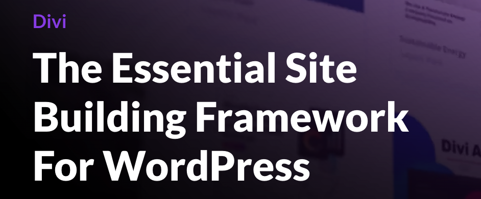
Divi
Divi is built by experts at Elegant Themes, a standout company with a proven track record of serving the WordPress community.
The all-purpose theme comes packed with a highly intuitive drag-and-drop visual editor. Better yet, you can easily customize how it behaves for different screen sizes directly from the WordPress dashboard.

Avada
Avada has been a top-selling WordPress theme on ThemeForest for a number of years, so stability, longevity, and user support are top-notch.
It comes with more than 120 pre-built elements, more than 100 fully pre-built websites, and an expansive library of creative content items to give you a head start on your design, all with one click. While it can seem complex at first, Avada has plenty of in-depth documentation to help guide you through your customization options.
Best free mobile-responsive WordPress themes
Free mobile-friendly themes are usually less feature-packed than their premium counterparts. While there may be a few customization options for colors or typography, you won’t have a great amount of control over your theme. That said, if you can find a solution that fits your requirements upfront, there’s no need for further customization at all!
To choose a quality example, first research the developer of your chosen theme to see whether they have a good track record with WordPress themes, because a poorly coded theme will create a myriad of usability issues for you and your site visitors.
Let’s take a look at a few good examples of free themes:

OceanWP
OceanWP is a lightweight, versatile WordPress theme perfect for any project. It’s fast, responsive, SEO-optimized, and mobile-friendly, with unique WooCommerce features to boost conversions.
Compatible with top page builders like Elementor, Divi, and Beaver Builder, it’s easy to customize and extend. Developers will love its clean code, while users enjoy professional designs and flexible settings for all devices.
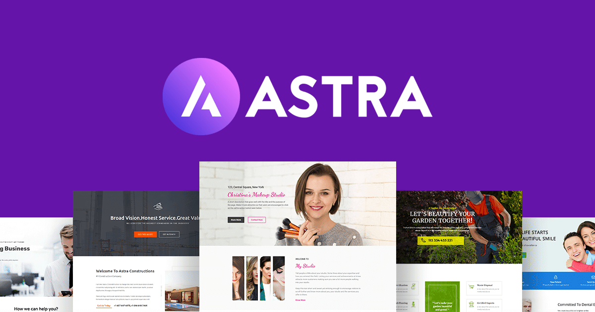
Astra
With 50+ widgets, 100+ website templates, and 200+ section blocks, Astra simplifies the creation of stunning websites, offering unmatched performance, lightweight design, and extensive customization options.
Astra’s responsive design and features enhance functionality and user experience, providing global options, header and footer flexibility, and zero bloat for fast load times. Whether for eCommerce, blogs, or portfolios, Astra effortlessly empowers developer creativity. Like many free WordPress themes, a Pro version that extends the theme’s functionality even further is available.
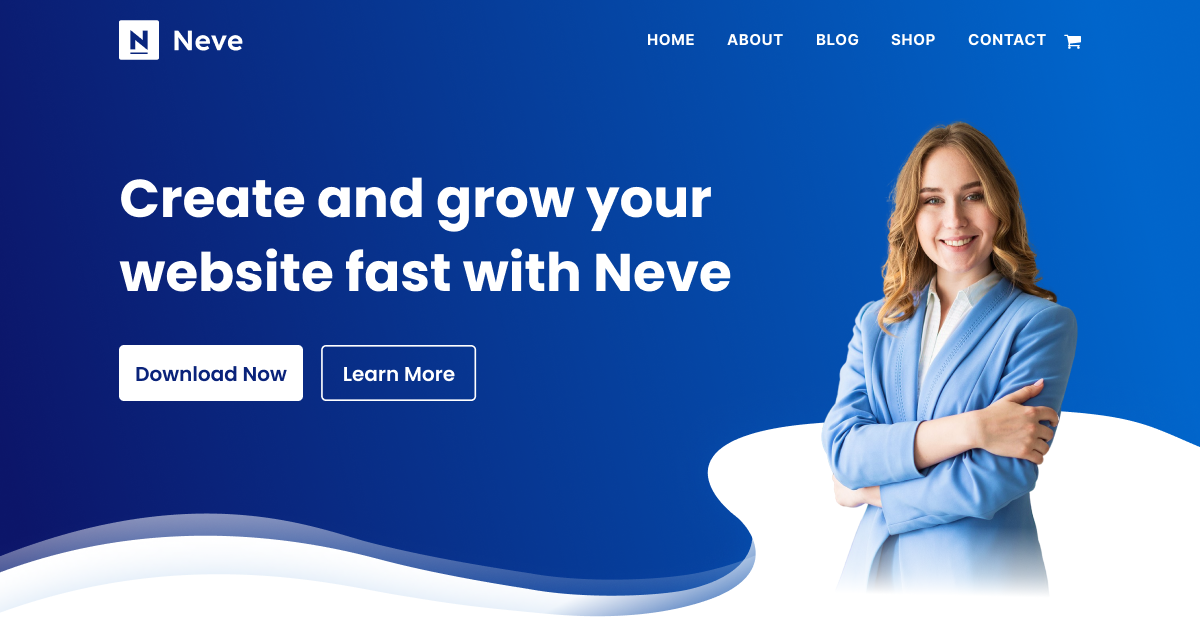
Neve
Neve is a free WordPress theme from the experts at Themeisle ideal for blogs, small businesses, and creative projects. It features drag-and-drop header and footer customization, flexible layouts, global color palettes, and seamless integration with Gutenberg and popular page builders.
With 100+ starter sites, AMP compatibility, and SEO optimization, Neve ensures a smooth setup and exceptional performance. Like Astra, Neve also has a premium version available.
Build your next mobile-friendly experience with WP Engine!
Mobile-friendly WordPress themes are essential for creating user-friendly, high-performing websites that look great on any device. Whether you opt for a free or premium option, choosing the right theme can elevate your site’s usability, SEO, and overall design.
Ready to take the next step? Explore WP Engine’s hosting plans, which include access to premium StudioPress themes, and build a website that’s fast, responsive, and optimized for success!